Intro
The product team was just the Design Director and myself at first until we added a Product Manager (who was basically a Project Manager and liased between engineering and product design). We worked beside engineering and utilized the Scrum process framework so our work was split up into sprints. The software I primarily used was Sketch and Figma to create user flows, wireframes, and designs. For prototyping and handoff, I used Invision and then later moved to Zeplin for handoff. For planning we used ZenHub and Monday, but then moved to Linear. Being still new to the world of product design, it took me some time to get used to the workflow and process.
Personas
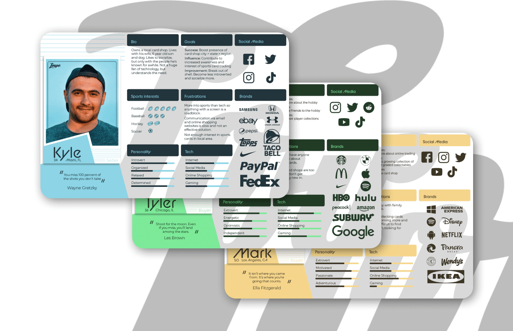
My first project at Loupe was to create three personas. This would help me begin to understand our users (both "sellers" and "buyers"/viewers) and what the app aims to accomplish. I began by interacting with the app. Watching and chatting with other users. Noticing what they were purchasing, how much they spent, and how they reacted. It also helped that we had a user survey that just came back with some useful information. I came up with a seller persona and two different buyer personas. One buyer would be someone who was considered wealthy and could be a big spender, the other would be your average white collar worker. We also decided to make the "wealthy" buyer persona a mobile user and the "white collar" persona a desktop user. We did this because my second project would be to begin planning and wireframing a web version of the app that could be used on a browser.
Web App
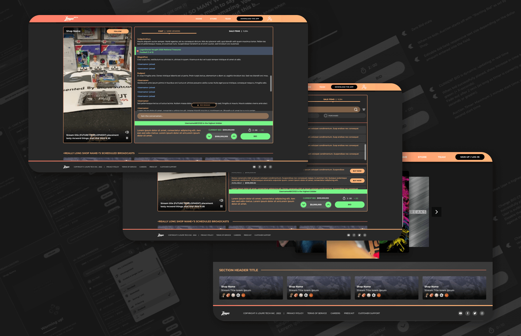
I utilized basically the same user flow as the app and began wireframing the web app. I started out by envisioning the final product and wireframing that. This way we could remove what we could from the concept based on what the specifications were for each sprint. We ended up stripping most of the features out of the design for implementation and the published product was very basic, but worked well and still looked great. It also didn't exactly look like the wireframes, but we liked how it looked and adapted the published look to future designs (like good 'ol Bob Ross said "we don't make mistakes, just happy accidents"). Since Loupe is a live streaming app, I took much inspiration from other live streaming apps and services, but primarily one of the most successful being Twitch. I really wanted to utilize much of the features that they released in a way that could add to a good experience for our users.
Auctions
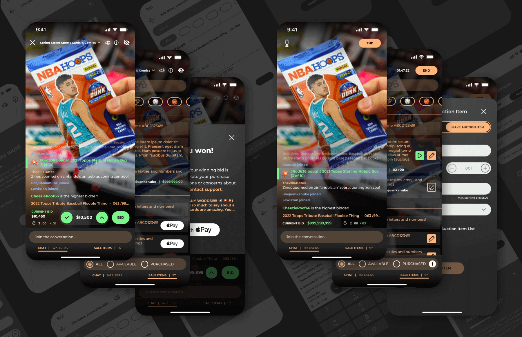
Another feature that I worked on that was released was Auctions. Our competitor was successful with auctions and it was in high demand. I found that the difficulty with designing competing features is that it's hard to separate your mind from what you're used to seeing in the competition and thinking outside the box. There were many considerations to think about, like "what if the user bids on an item and then leaves and wins the auction?", "what if the stream disconnects in the middle of an auction?", "what if a user wins an auction, but doesn't pay?". I had to make sure a user could easily identify that they've placed a bid successfully and differentiate a bid from a win. This was one feature that we didn't really strip down due to most of the functionality being essential. That, coupled with the fact that it was a feature in the mobile app, made this be the most rewarding project that I worked on at Loupe--even though I fully designed the web version (auctions never made it to web while I was employed, but was designed).
Wallet
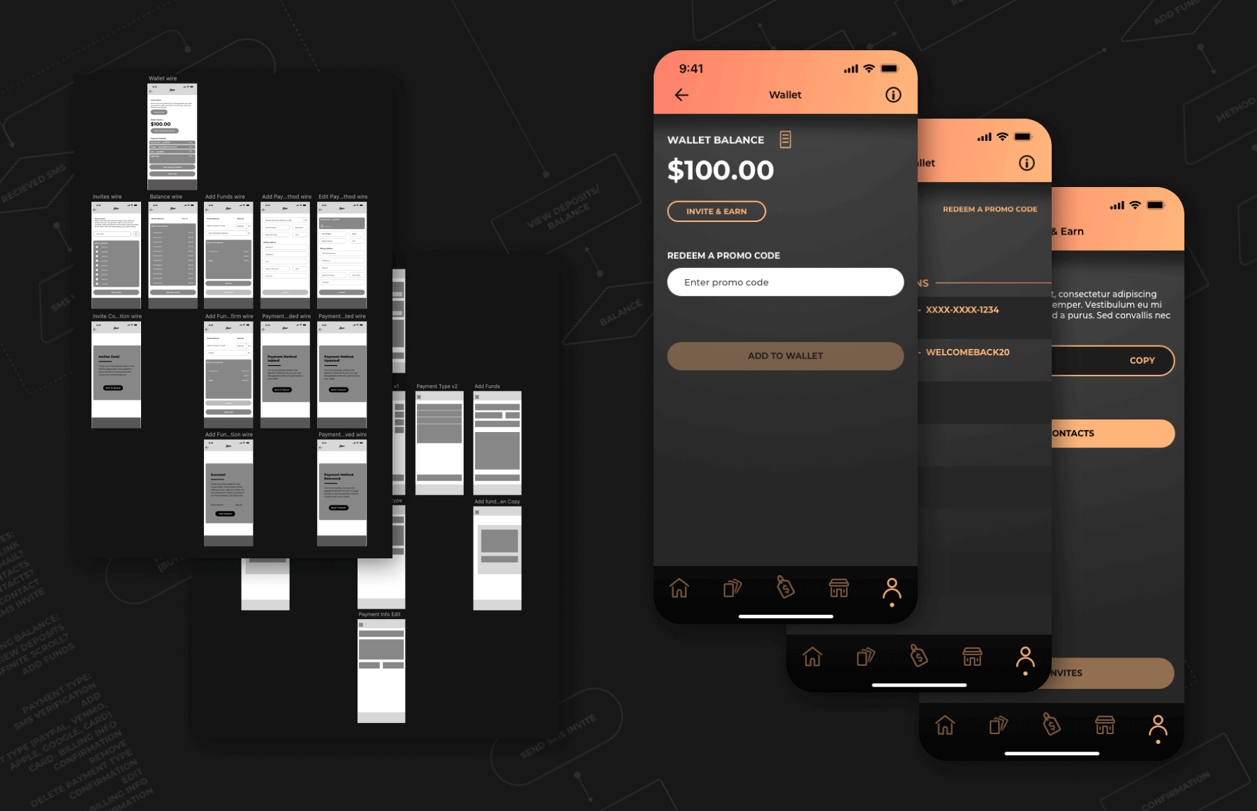
We wanted to be able to give users credits and enable them to invite others to earn credits, so we needed a wallet system. In the end we only displayed an account's funds at the top of the home screen, but I did wireframe a full concept for a wallet system with payment methods, a contact list (that utilized a users internal phone contact list) to send invites, and a transaction history. The system was only for funds going in to the app, not coming out (we didn't want to become a bank).
Clips
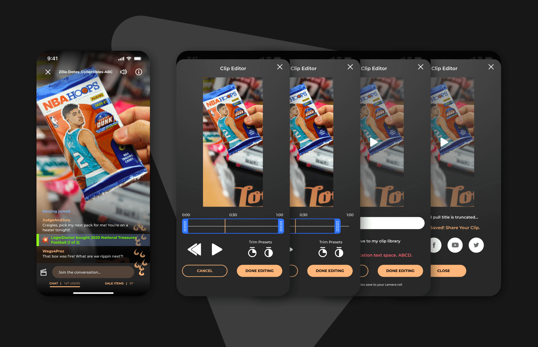
Being a big fan of Twitch, I naturally wanted to implement a clipping feature. Many users would make a purchase and they would pull something valuable and screen recording on the phone doesn't capture the past. I wanted to allow users to click a button and capture the last minute of video, which they could quickly edit and share or save to their device. Conceptually, at a minimum, they'd be able to click the button and instantly save the last minute of video to their device that they could then edit in a 3rd-party app later on.
Android Pre-sale
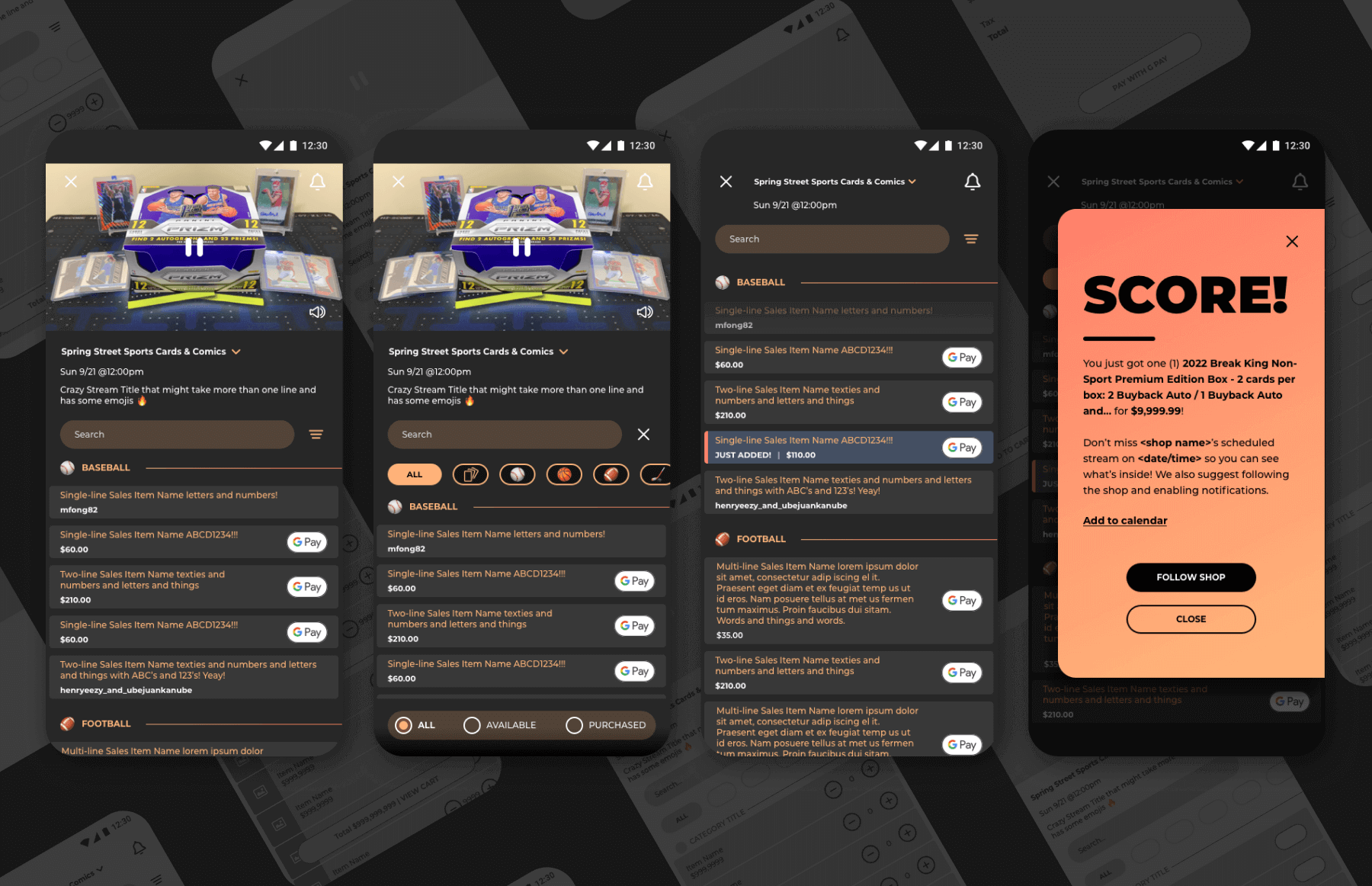
iOS users had the ability to purchase items from a shop before they went live if they had a scheduled stream with an inventory, but android did not have this capability. Iutilized this opportunity to modify the current layout and add space for a promotional video at the top of the sales item list as well as adding a cart feature. The feature was stepped down before wireframing was finished.
Various Other Concepts
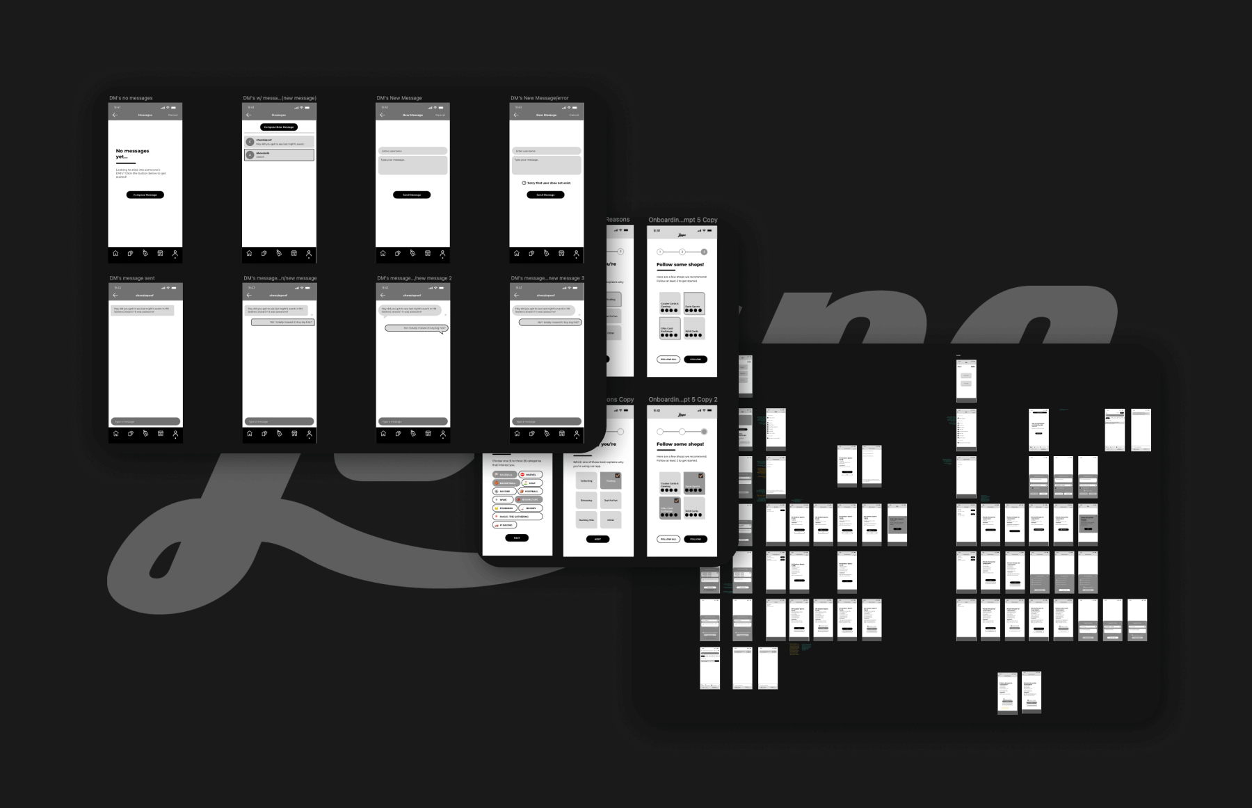
I worked on other concepts such as direct messaging, inventory management, onboarding, and private streams, but they never made it to production or even full design. Direct messaging was pretty straight forward--users could message each other within the app.
Inventory Management was for sellers to be able to create different inventories to add to streams. This way if they had an event that was only to sell a specific item, they wouldn't have to import it separately. They could add, edit, and remove items in bulk right from the web (this was originally intended for web).
I remember seeing sites like Reddit which ask you to select some categories upon your first visit so they could tailor your feed to your interests. I worked on wireframing a similar feature for Loupe to see what something like that could look like.
The last project I worked on also never made it to the final stages, was private streams. We wanted to give certain users the ability to schedule a private stream with a seller sothey could invite friends and have a more personalized experience. There was more to consider for this than any other feature I had worked on as there were 2-3 points of entry foreither user.
